A tidy approach to interrupted time series (ITT) with ARIMA modeling in R
I recently did a deep dive into time-series analyses and during my exploration, I ran across a paper that demonstrated an approach to running interrupted time series analyses with ARIMA modeling (for more detail, I recommend reading the paper!) The author was helpful enough to include R code so that we could work through an example of this approach. Given my penchant for all things tidyverse, after running through the example (which uses the astsa, forecast, dplyr, and zoo packages), I went on to reproduce it with the tidyverts packages (as well as lubridate and tidyverse.)
Let’s get to it!
# Load packages
library(tidyverse)
library(lubridate)
library(tsibble)
library(fable)
library(feasts)
The dataset for this can be downloaded from the paper, so start by jumping over to the original paper (I also suggest you give it a read if you haven’t already) and you can find the quet dataset in the supplemental materials. The data looks at dispensing for the 25 mg tablet strength of quetiapine, an antipsychotic between Jan 2011 and Dec 2014. The Australian government eliminated refills on Jan 2014 in an attempt to deter prescribing for non-approved indications. The object of this analysis is to determine the effect that this ban had on dispensing.
Let’s start by uploading the data and converting it into a tsibble object.
# Load data
quet <- read_csv(file = 'quet.csv')

# Convert data to time series object
quet.ts <- quet |>
  mutate(month = as_date(month, format = "%d-%b-%y"),
         month = yearmonth(month)) |>
  as_tsibble(index = month)

# View data
glimpse(quet.ts)

## Rows: 48
## Columns: 2
## $ month       <mth> 2011 Jan, 2011 Feb, 2011 Mar, 2011 Apr, 2011 May, 2011 Jun…
## $ dispensings <dbl> 16831, 17234, 20546, 19226, 21136, 20939, 21103, 22897, 22…
Next, let’s take a look at the data, along with the ACF and PACF plots.
#Plot data to visualize time series
quet.ts |>
  gg_tsdisplay(y = dispensings, plot_type = "partial")

Taking a look at the raw time-series, it looks non-stationary to me and there are some seasonal trends in prescribing, so some form of differencing is probably warranted. Looking at the ACF/PACF plots, it looks like an arima(1,1,0) model, but let’s take a look at these plots after differencing.
quet.ts |>
  gg_tsdisplay(y = difference(difference(dispensings,12)), plot_type = "partial")

Differencing looks to have done a decent job making this data stationary, but more challenging in terms of selecting a good model just by eyeballing the plots. We’ll let Fable’s ARIMA algorithm choose the best fit, but first, we need to create variables that can capture the predicted effect of the intervention.
Intervention effects
For this intervention, we want to capture two predicted effects — a sustained decrease starting with the first month of the intervention and a sloping decrease that grows over time. The first effect is captured by a step (or level shift) variable, which is a dummy variable that is 0 for all months prior to the intervention and 1 for intervention months. The second is a ramp variable, which is 0 for all months prior to the intervention and starts with 1 on the first month of the intervention and increases by 1 from there (e.g., Jan, 2014 = 1; Feb. = 2; etc…)
# Create variable representing step and ramp changes
quet.ts <- quet.ts |>
  mutate(step = c(rep(0, 48-12), rep(1, 12)),
         ramp = c(rep(0, 48-12), seq(1,12,1)))

#View the step and ramp variables
quet.ts |>
  pivot_longer(cols = c(step,ramp),
               names_to = "variables",
               values_to = "value") |>
  ggplot(aes(x = month, y = value, color = variables)) +
  geom_line() +
  labs(title = "Visualizing step and ramp variables") +
  theme_minimal() +
  theme(panel.grid.major.x = element_blank(),
        panel.grid.minor.x = element_blank())
ARIMA model
Now it’s time to run our ARIMA model! This is where I deviate somewhat from the original paper, essentially letting the Fable algorithm fully dictate the model parameters (whereas in the paper, they specify seasonal and non-seasonal differencing parameters.) It turns out, the parameters end up the same anyways.
Next, we plot the residuals, the acf plot, and a histogram to ensure that they approximate a white noise series. The plots appear to show this, with no apparent autocorrelation and approximately normally distributed residuals. A Ljung Box test also supports this conclusion, failing to reject the null hypothesis that the residuals are independent.
(Note: I have qualms with this particular test, as failing to reject a null hypothesis is not the same as confirming its truth — it seems to me an equivalence test would be more appropriate, but I understand the complexity there and this discussion goes beyond the scope of this post…)
# Use automated algorithm to identify p/q parameters
# Specify first difference = 1 and seasonal difference = 1
m_quet.ts <- quet.ts |>
  model(arima = ARIMA(dispensings ~ step + ramp, stepwise = FALSE))

#Plotting model residuals
m_quet.ts |>
  gg_tsresiduals()

#Ljung-Box test
augment(m_quet.ts) |>
  features(.resid, ljung_box)

## # A tibble: 1 × 3
##   .model     lb_stat lb_pvalue
##   <chr>        <dbl>     <dbl>
## 1 arima  0.000000851     0.999
With our model assumptions satisfied, we can take a look at our model estimates. We can see that Fable’s ARIMA model has recovered the same estimates as the auto.arima model from the original paper, with an estimated immediate drop of 3,285 dispensings and additional estimated reduction of 1,397 dispensings for each month after the new policy was enacted.
report(m_quet.ts)

## Series: dispensings
## Model: LM w/ ARIMA(2,1,0)(0,1,1)[12] errors
##
## Coefficients:
##          ar1      ar2     sma1        step        ramp
##       -0.873  -0.6731  -0.6069  -3284.7792  -1396.6523
## s.e.   0.124   0.1259   0.3872    602.3356    106.6328
##
## sigma^2 estimated as 648828:  log likelihood=-284.45
## AIC=580.89   AICc=583.89   BIC=590.23
Finally, we can run a counter-factual model in which we forecast dispensings for 2014 given the model parameters from our initial model, minus the step and ramp parameters. This gives us a visual of what we would have expected had the new policy not come into existence!
#Modeling counterfactual
m_quet_counterfactual.ts <- quet.ts |>
  filter(month < make_yearmonth(2014, 1)) |>
  model(arima_null = ARIMA(dispensings ~ pdq(2,1,0) + PDQ(0,1,1, period = 12)))

#Forecasting counterfactual and plotting against actual data
m_quet_counterfactual.ts |>
  forecast(h = 12) |>
  autoplot(quet.ts) +
  geom_vline(xintercept = as.numeric(as_date(make_yearmonth(2014,1))),
             linetype = "dashed",
             color = "grey") +
  scale_y_continuous(expand = c(0,0),
                     limits = c(0, 50000)) +
  theme_minimal() +
  theme(panel.grid.major.x = element_blank(),
        panel.grid.minor.x = element_blank())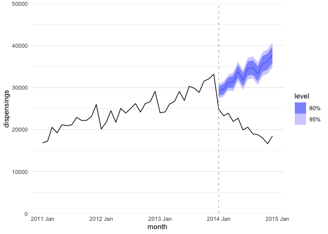
Note. The black line is the real data and the purple line is the forecasted counterfactual.
And there you have it — if you’re the sort who prefers a tidy workflow, you can now reproduce the ITT ARIMA approach from Schaffer, Dobbins, and Pearson (2021) with a tidyverts workflow!